Tuesday, January 31, 2012

A Dresser With a Past


Yesterday, I randomly checked Craig's List for a dresser for The Lady's room. In one of those "it was meant to be" moments, I found this gem. It's perfect in style, dimension and purpose. I'm not the biggest fan of shabby chic, but inspiration has lead me down that path for The Lady's room. This dresser is the shabbiest, so it will have a bit of a face lift in the coming days. JJ did an amazing job on the mirror, so I'm going to give her free reign. In this case, mom knows best.

On a strange note, the dresser had some very heavy negative energy. It was so strong, I wouldn't bring it in the house. I know, I know. I'm going all Northern California on you, but really, it was weird. So I put it in the storage room and JJ and I cleared it by burning sage. If you've never done this before, you should know to open all the doors and windows because it smokes and smells like a Dead concert, but without the pleasant side effects. On the other hand, we didn't have the urge to eat a pack of Oreos and a bag of Cheetos.

Made by the Sligh Furniture Company of Grand Rapids, Michigan. I'd guess somewhere between 1915-1935. 

Interior view. The top drawers may be removed for a place to keep the Lady's dolls.

Detail of the door.

Detail of the skirt trim.


Lighten up! Traditional Style Exhales and Finds New Life

 My friend MV moved to Prosper. I know, she's nuts. I tried to convince her to come back to Dallas to no avail. Her singular goal: land for her growing boys to run. So she left the desperate housewives of Frisco in the dust for some neighbors grounded in reality and surrounded by the natural beauty of the Texas prarie.

What I love most about MV is that she fears neither change nor challenge. Her new home has a lighter perspective and invites one to relax and enjoy the scenery. But what to do with those serious traditional leftovers? Wonder Woman rises to the design challenge and change is in order.

View photo.JPG in slide show
Before: A serious damask with walnut finish.The Prosperous MV picked this up for a song when she lived in a more in more traditional home, but now her home is filled with natural light and a casual Texas vibe. No need for drama. With two boys, two careers and a hubby that keeps her on her toes, she's got enough drama. My gal needs some peace, already.
  
View photo.JPG in slide show
After:  Neutral tones invite my sweet friend to relax. The chair remains lady-like, but now she's a lady that embraces the light side of life. Gone is the drama. In its place, a soothing spot for a well-deserved quiet moment. Exhale and sip your cuppa tea.
 
Before: An armoire intended for the nursery. But now, the V Boys are growing fast and have big boy closets. So what does a creative lady do when the nursery furniture becomes obsolete?
View photo.JPG in slide show
After: Paint, stencils and a little distress reveals a shabby chic classic. And (this is the best part) it's her first transformation project! A new talent is revealed and maybe another vocation. If I had a truck and a key to her house I'd swipe it for my Lady's pink bedroom.


Sunday, January 29, 2012

Magical lights for the patio

I snapped a shot of these last night at a true Goddess' special event. I love the simplicity of a paper lantern but en mass they are magic. Just like the Goddesses in attendance.

Friday, January 27, 2012

Dining Room Challenge


So as of today, the living room, office and kitchen are on their way to being furnished, comfortable, inviting and inhabited. There are nits and nats that must be addressed,  (except for the living room curtains. That's JJ's forte). For the most part, it's the fun stuff: accessories, art and tweaks here and there.

The same cannot be said of the dining room.

And here's my challenge...


This was the dining room as purchased. At least it wasn't red.


After renovation but before the chandelier. The doors are removed. Floors stained. All walls were painted white as we have no clue, even 6 months later, what color scheme we will go with. Still lacks personality. Is this the most boring room in Dallas? Not for long.
 
The Foscarini Caboche Chandelier. My Dear Sweet Husband's choice. He's so good. Now the room is showing some signs of life. Modern and glamorous.  

Detail of the chandelier.

So this is what I have to work with. The good news is that it is truly a blank canvas. The bad news is that I can do whatever I want, but I have NO CLUE what that is.

So let the brainstorming begin! 

Monday, January 23, 2012

The Face of Serenity


Detail of the monk that welcomes guests and family. I'm not feeling well today. The Mountain Cedar pollen is kickin' my posterior. So I'm going to keep this image in my mind today and try to relax, breathe as deep through the congestion and let the peace come to me.


The Play Room in Progress

The Playroom in Progress. A couple of items to add:
A fuzzy rug
A couple of grown up chairs
Add more color in the form of objects and art


I got the vintage map at Lost down on Riverfront. I bought another on at Lula B's, but failed to measure the wall space, so now I have an extra. Dang! If you want it, I'll make you a deal. I may list it on Modern Hindsight if I can't make it work in Mr. Personality's Room. Book cubes from Ikea AND they actually survived the move. Impressive.
 
The reading corner, but I think it's time for some grown up chairs. I'm not impressed with the black frames, but white will disappear. I bought some book rails to keep the favorites handy, but they are also white. I'm thinking this room needs more pop. Bring on the color.

Vintage map with robust color. 

The Lady sees pink in everything.

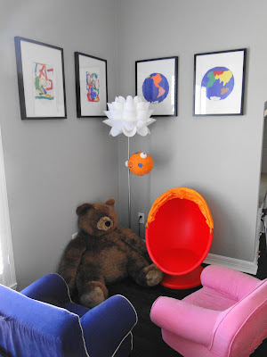
Color. Form. Space. The Lady sees it. Can you?


Finally...a Cocktail Table

Drum Roll Please!!
The cocktail table finally arrives. I've been looking at this table for the past two years but it was way more than I was willing to pay. I found it at the Wisteria Outlet 2 weeks ago at a rock bottom price. Try $1400 less than MSRP. And there's not a scratch on it. SCORE!!


I love it. The kids love it. The dog does not. I have placed a huge impediment in the middle of his napping space. I'll have to make it up to him.


Monday, January 16, 2012

Bookshelves


Color inside the bookcase. I think the bookcase in the 2nd floor foyer needs this desperately. Photo: InStyle. 

Nice placement. Photo: House and Home.

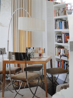
A card table attracts kids and adults to leave the electronics behind for awhile. Imagine that! I don;t have room for it in my office. Maybe the sitting room? I really like the idea of a spot for friendly competition. Photo: House Beautiful. 


Kitchen Before and After Photos

Kitchen as it was
June 2011
The original kitchen was warm, but dated. A few updates had been added; the granite backsplash and countertop on the island, rubbed bronze hardware. Pretty standard fare in Dallas. While we prefer a cleaner, more modern look, the room had an abundance of natural light, ample storage space,Thermador appliances and plenty of room for friends to gather.
 
Kitchen as it is
December 2011
Mission accomplished (mostly). Transformed into a light, clean, modern space. Bold colors pop, sunlight flows in from the windows and is reflected in the stainless steel mosaic backslash, Silestone countertops and Thermador appliances. It took a few months to notice that we had missed an opportunity for another interesting light fixture over the island. I'll be hunting for a light this year. The barstools were leftovers from our previous home. They are too low for this counter, but I like the pop the red provides. They will be replaced at some point.

Kitchen as it was
June 2011
Dental mouldings, faux plaster paint effects, mismatched countertops and honey stained floors. I'm sure this kitchen rocked 1992. It had good bones, but had become tired. It needed a breath of fresh air. That's our fearless contractor, Michael Warner and his ever patient gal pal Tracy in the photo.

Kitchen as it is
December 2011
Clean countertops, modern handles on the cabinets, updated cabinets, stainless steel mosaic tiles and a dark floor bring the kitchen into the 21st century. It's amazing what white paint and reflective surfaces can do to a room. The space is fresh with new positive energy. Kudos to my Dear Sweet Husband and MW for the backsplash tiles.

Breakfast Area as it was
June 2011
The space was dark and narrow. The sliding glass door was old and rusty. The light fixture the standard Dallas wrought iron and frosted amber glass. Not our cup of tea.
After! Let there be light!!


Saturday, January 14, 2012

Northern California on my mind


I found these pieces at the Fine Eye Gallery in my hometown, Sutter Creek, California. Laura Faye Mah indeed has a fine eye. She captures the essence of the Sierra foothills, the colors, the serenity and pace of life. These are, ironically, all of the things I hated so much growing up here. Guess it took middle age to appreciate it. Now I miss it terribly. Especially this time of year when the hills are a glorious green and the air is crisp. Saturday afternoons browsing in antique stores with JJ. In search of nothing in particular, but often discovering objects that channel my grandmother and her mother. Franciscan Rose china, roses and little birds on everything, the Flamingo mirror, cigarette holders, pink glass ashtrays that weighed 10 pounds. A passing glance at a material object and one is pulled into the past. That musty smell of 1960's damask upholstery acts as a time tunnel to Christmas 1962. Or 1972, for that matter. The orange Bauer pitcher that collected dust in the kitchen; the one my grandmother promised to me and, unbeknownst to me, apparently every other child and grandchild in the family. I love that my uncle ended up with it and that JJ was so concerned I'd be upset, that she got me one just like it. And just like that, a connection is made with the past. Because its not about the object. It's about the memory the object evokes; even if that memory is a little different for my uncle, for JJ and for me. And that's a beautiful thing.
Wow. Talk about going off on a tangent. Guess I'm a bit homesick.


Progress in the Living Room

Southern perspective. Waiting for the cocktail table....

Western perspective. The pair of chairs and side table are vintage from Antiques Moderne.
Lamps from Arteriors too. Thanks to Matthew for being so very patient with my indecision over the shades.
Fabric from Childress Fabrics for sofa throw pillows.
Fabric for the Dunbar Chairs. This fabric is not, as Nina Garcia would say, "Editorial". In other words, it does not photograph well. It is, in fact, black, slate blue, slate grey and taupe. It was the inspiration for the color scheme in the room. Fabric from Childress Fabrics.
Dunbar Chairs. Unfortunately, I erased the "before" photo of the pair of chairs (A rookie iPhone move. My phone should say "Hey! You!! Are you paying attention? Are you sure?!?! Really??" before it deletes an image.). Trust me when I tell you that they are much improved over the nubby stinky orange polyester state they arrived.
Rear view of the restored Dunbar Chairs

The Lady's Room continued


A quick mock up of the canopy. The mirror doesn't work and will be replaced with something with some Frenchy punch. The amazingly talented JJ has agreed to design the new custom pillow covers.
 
This room is begging for a fancy vanity table. I'm on the hunt for it. Vintage slipper chair in pink velvet with rhinestone buttons. The chair came from eBay and the fabric was a remnant from Fabric Factory. White stool used as a kid-sized side table from Wisteria. Pottery Barn kids rug.
 

Paper flowers bloom over fairy tale images. The Lady wants princesses, but I can't stomach the ones you find at the Target. So Edward Ducat prints stand in for pedestrian cartoons. 


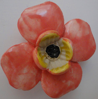
Vintage flowers inspire the color scheme.


Rosy knobs for the bathroom cabinet  from Anthropologie.


Dogwood knobs for the vanity  from Anthropologie
 

Thursday, January 12, 2012

The new cocktail table


Stacked Stainless Steel Coffee Table | Coffee Tables | Wisteria
The new cocktail table. On clearance from the Wisteria outlet at an amazing price! SCORE!! 


Stacked Stainless Steel Coffee Table | Coffee Tables | Wisteria (clipped to polyvore.com)

Tuesday, January 10, 2012

Pink Bedroom 21; Andie 0

Last night 'Bama beat LSU like a rented mule. A travesty. Condolences to my fellow Tiger fans. Let's not forget the magical undefeated season and the SEC championship. Still...it would have been awesome to have stretched it into the post-season.

Yesterday, I had my own blow-out of sorts. And, yes, I am being overly dramatic. And yes, this is very much a White People Problem (Google it. SNL January 7, 2012). I'm having design drama with what has become my arch nemesis....The Lady's Pink Bedroom. Everytime I bring a new idea, I get sacked. Every new fabric is blocked. Everytime I think I have a solution to the canopy/bedding issue, I fumble it. I got nothin'. Pink Bedroom 21; Andie 0. I've got to get it out and move on. Here goes:

This room continues to frustrate my design vision. I let The Lady pick the paint, not realizing that these particular shades would be IMPOSSIBLE to coordinate, let alone match. Why in the world did I allow a FOUR YEAR OLD CHILD to pick the color?!? What was I thinking? I have purchased several yards of fabric (custom, non-returnable, mais oui) that matched the paint chip, but absolutely do not match (or even coordinate) once they get in the room. Is it the natural light? The oxygen? Is it the fact that no room, not even Mary Kay's, should be this pink? I hate pink. I'm changing Domicile's colors.

I managed to get the canopy (such that it is) up over the weekend, but the weird chair rail on the wall cuts it visually in half. I can't decide if it's cute or if it sucks. I bought 4 duvet covers from PBKids all of which are going back.The fabric is wrong. The curtains are too short. The bedding is the wrong color. I made The Lady cry when I said I didn't like princesses and that a real princess goes to med school, put off marriage until her 30s, children until 40 and retains her maiden name. Ok, I was projecting, but it's a solid plan for financial independence. As JJ says, "You may be overthinking all of this."

It started out fun, but the room has a life of its own now. I feel like I'm trying to put a tomboy in a gown. It just isn't working and I'm dejected and generally unpleasant. It has thrown the whole idea of Domicile up in the air. If I can't do my girl's bedroom, how can I anything else?  AAARRRGGG! 

Ok, that feels better. Time to focus on the positive and leave it alone for a couple of days or weeks or months. It will come together and it will all seem easy in hindsight.

See...I told you it was a WPP.

Tuesday, January 3, 2012

Design Bucket List


1. A sailfish. Yes. A Sailfish. This one is at Lost in Big D. I love it. Love it. Love it. Don't buy it! I want it!

2. An Eames lounge chair. Black leather and walnut finish.

3. The Egg Chair by Arne Jacobsen. Red.